
Introduction to Problem Space
My initial interviews and research revealed the following insights and assumptions:
Money
Aspiring musicians are usually low on funds to invest in proper studio equipment, audio engineering and music education.
Aspiring musicians are usually low on funds to invest in proper studio equipment, audio engineering and music education.
Space + Equipment
Most musicians don't have space to set up a fully operating professional studio.
Education
New musicians don't have the knowledge and education to properly engineer their music themselves.
How might we help emerging artists produce a more professional sound.
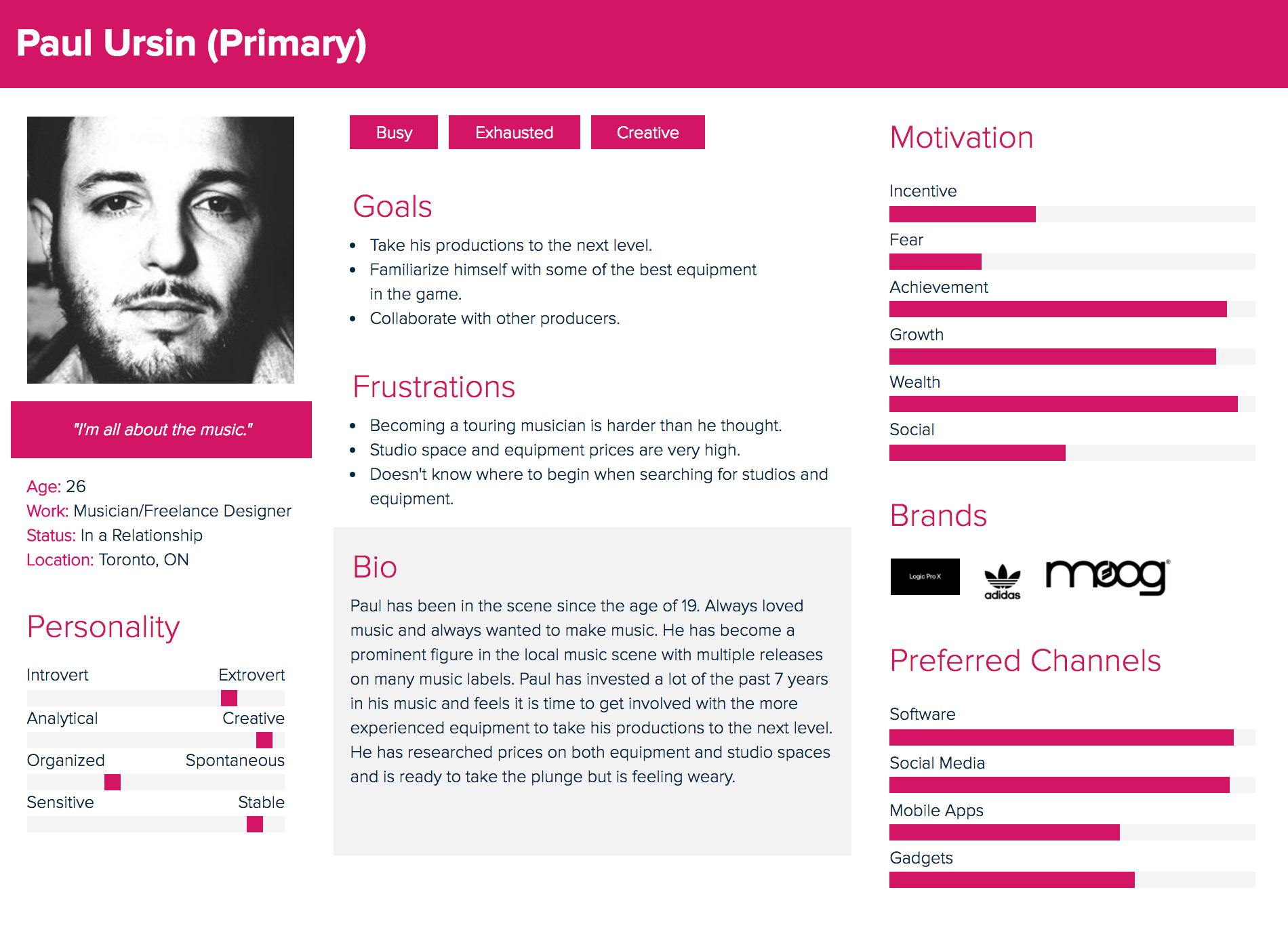
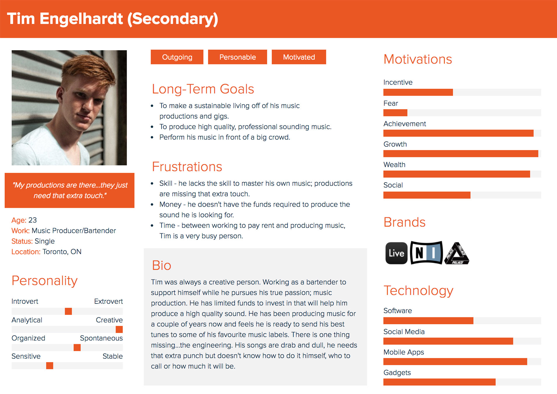
Personas
Market Competition
Landr
- online audio mastering
- instant results
- monthly fee
Insights about Landr:
I found that musicians who were familiar with Landr's services felt the algorithm didn't give the music the human feeling. Prefer getting mastered by a professional.
- instant results
- monthly fee
Insights about Landr:
I found that musicians who were familiar with Landr's services felt the algorithm didn't give the music the human feeling. Prefer getting mastered by a professional.
Studiotime.io
- book studio time anywhere
- advertised as Airbnb for studios
- new and not very trustworthy
Insights about Studiotime:
This new service isn't very trustworthy, they don't have an SSL certificate so the website isn't secure. Big red flag when dealing with credit card information.
- advertised as Airbnb for studios
- new and not very trustworthy
Insights about Studiotime:
This new service isn't very trustworthy, they don't have an SSL certificate so the website isn't secure. Big red flag when dealing with credit card information.
Inspiration
I took inspiration from Etsy, Spotify & Airbnb.
Iterations
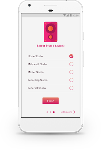
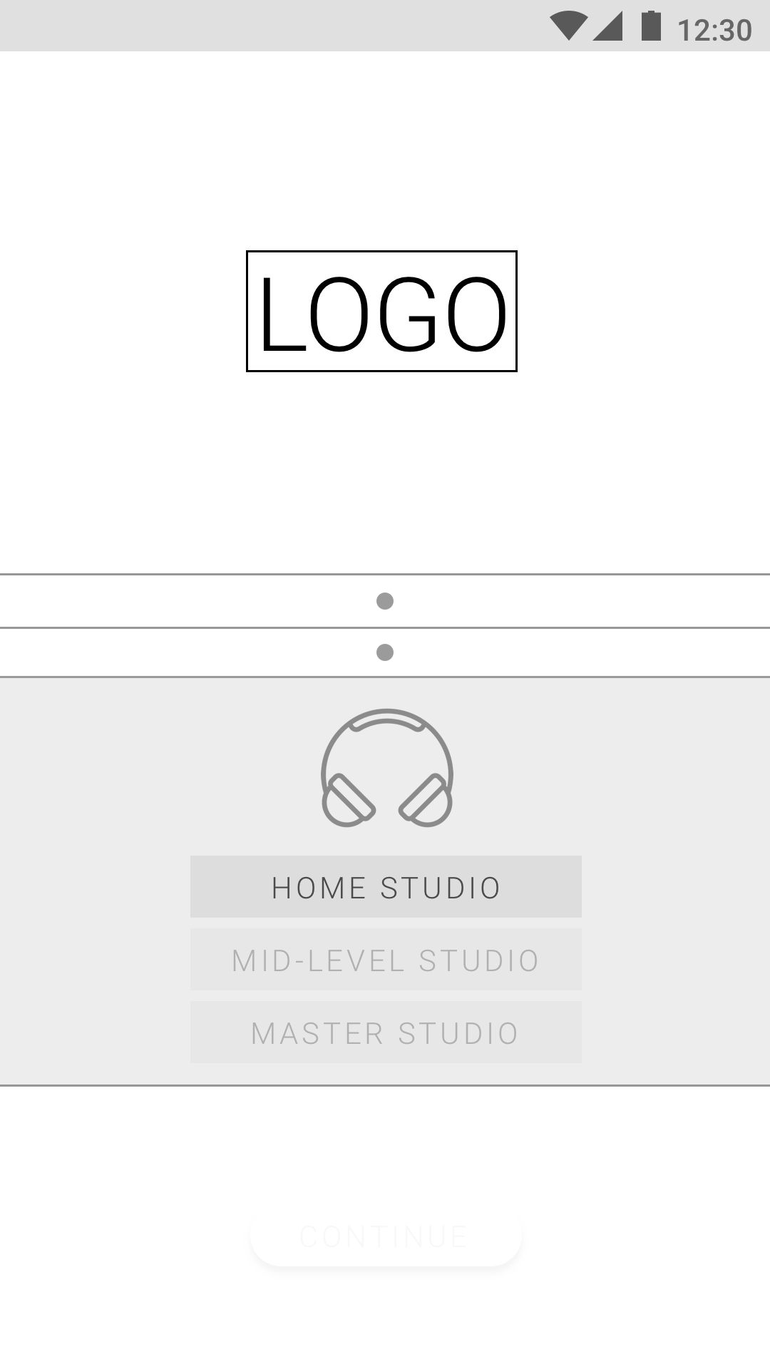
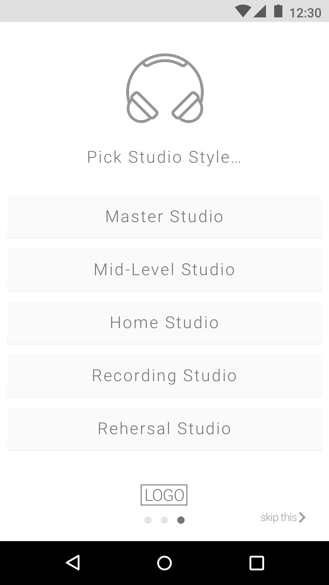
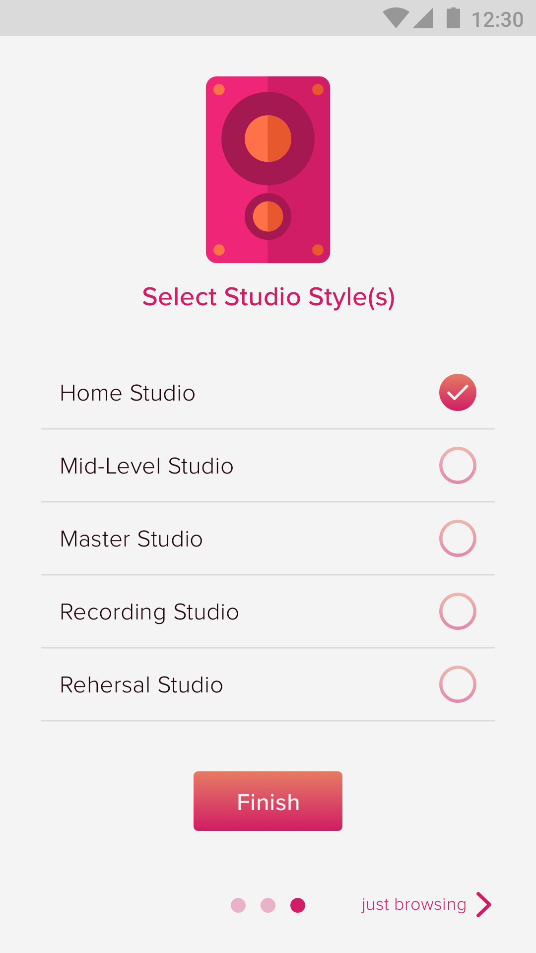
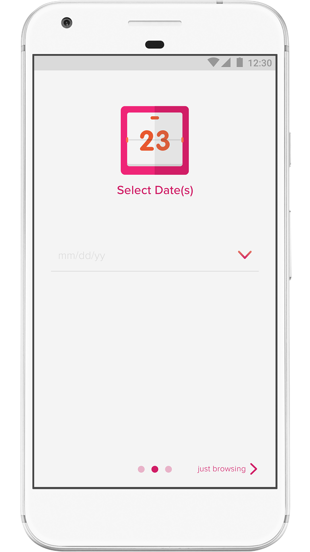
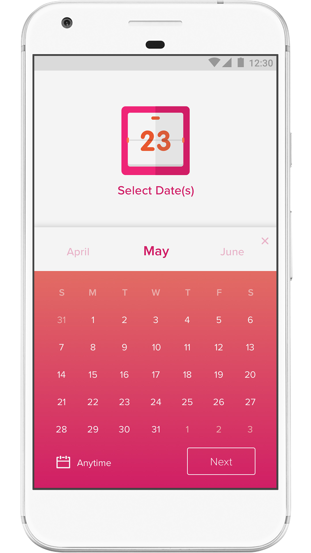
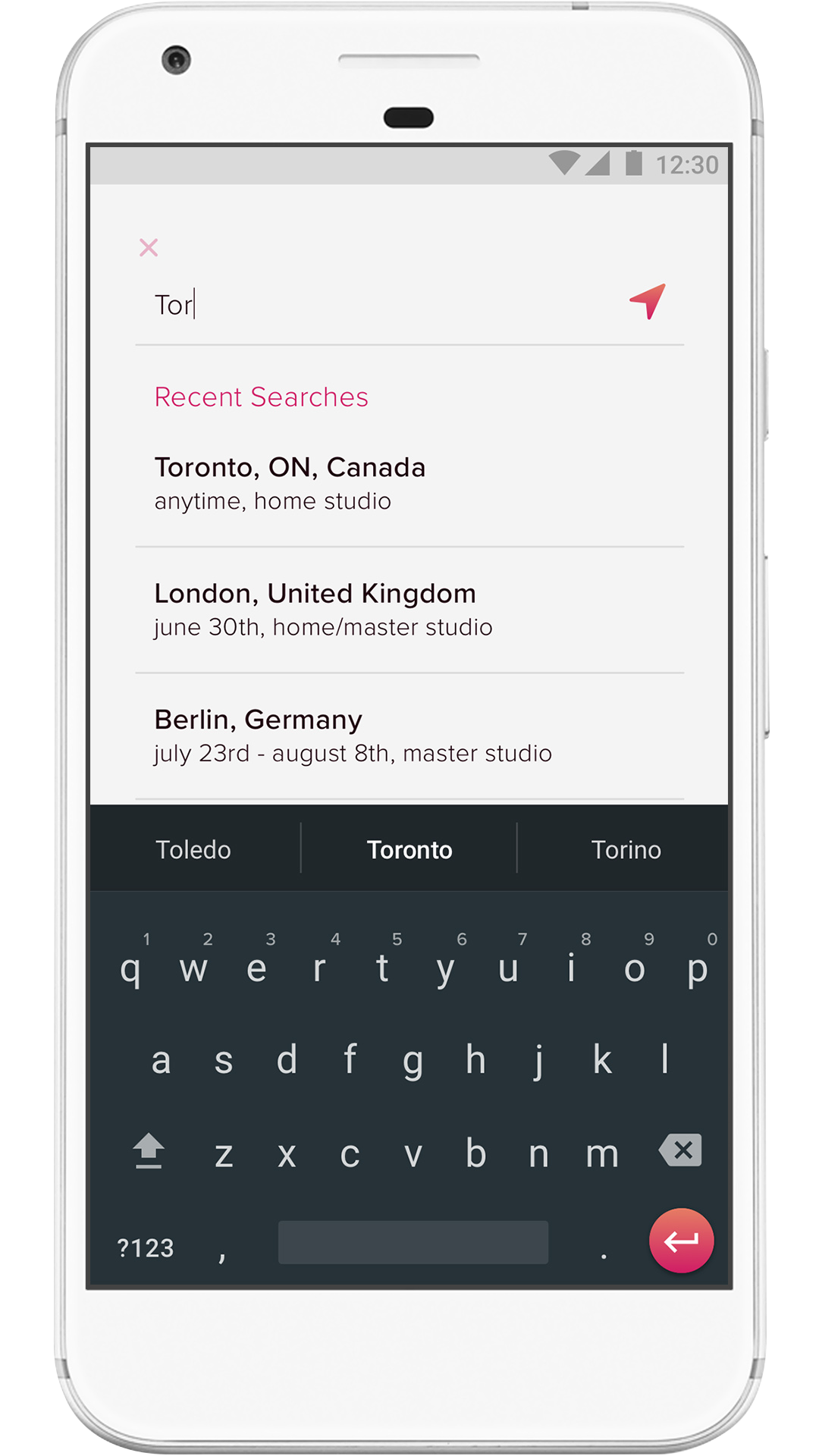
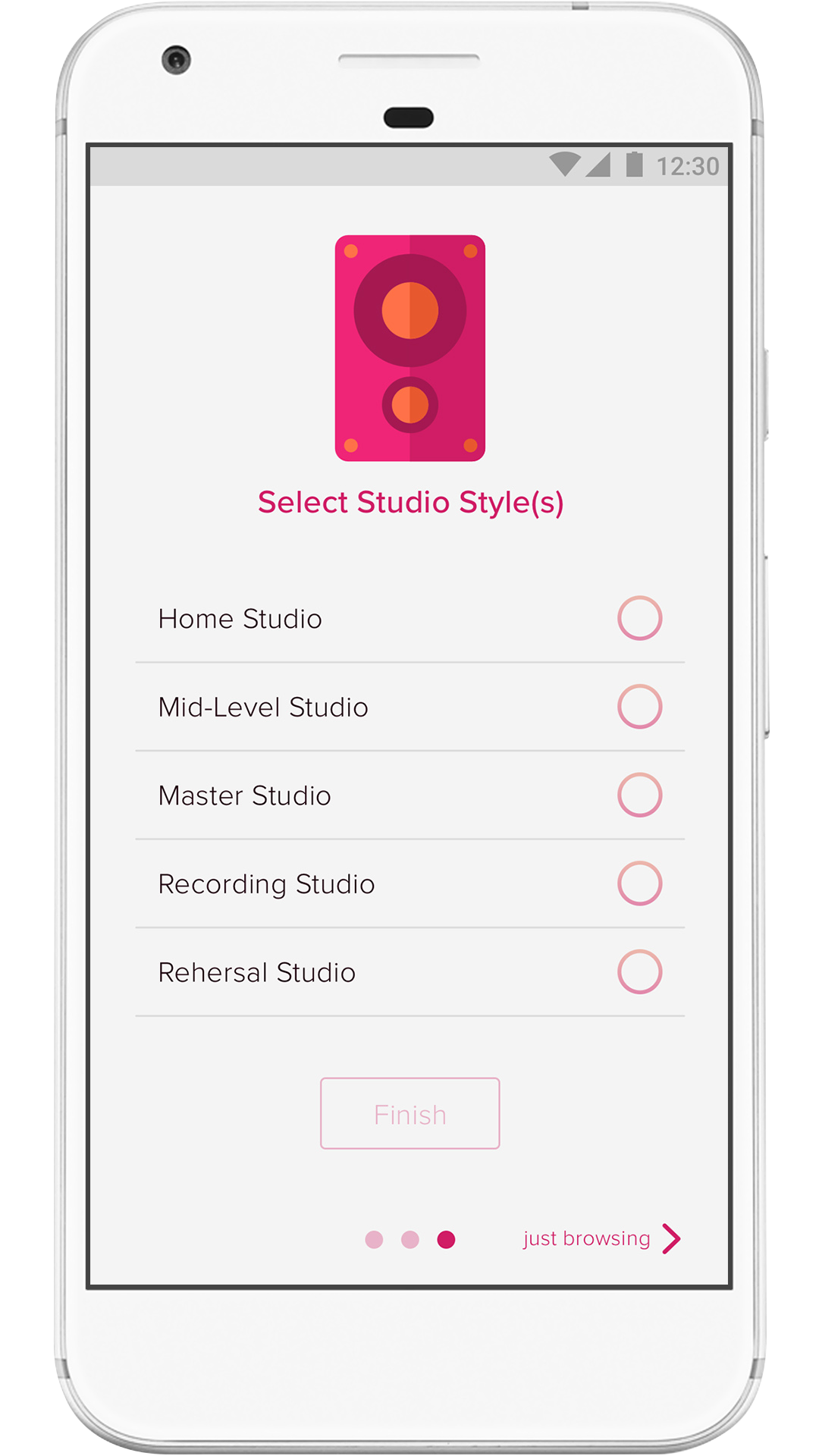
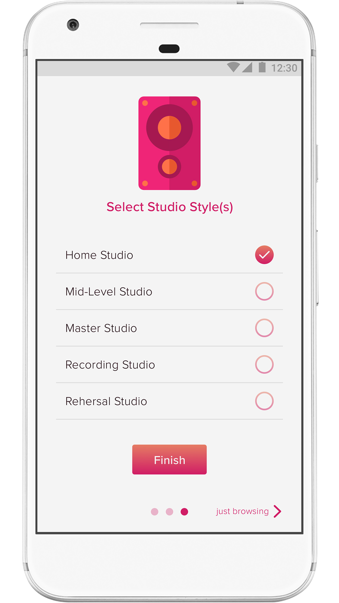
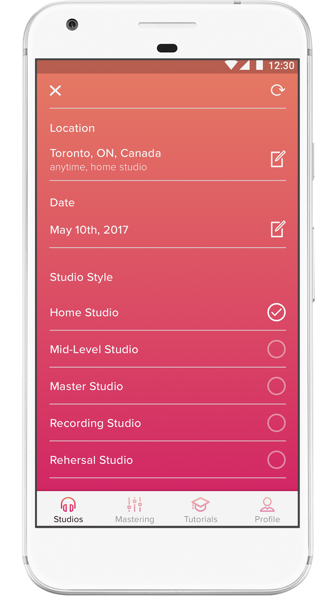
Welcome Screen - Left to right: 1st, 2nd, 3rd iteration
Through user testing I was able to come up with these outcomes. In my first iteration I had utilized the design of collapsing cards, indicated with the dots. This wasn't very clear for the user and they immediately got lost, confused and weren't sure what to do next. Users also felt there should be more studio options, and that the continue button in the first iteration was extremely difficult to locate. There was no option to skip this process if the user was just simply looking to browse with no specific style, location or date. In the second iteration there were all the options users were looking for but, they didn't feel like they could select for than one style.
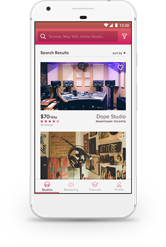
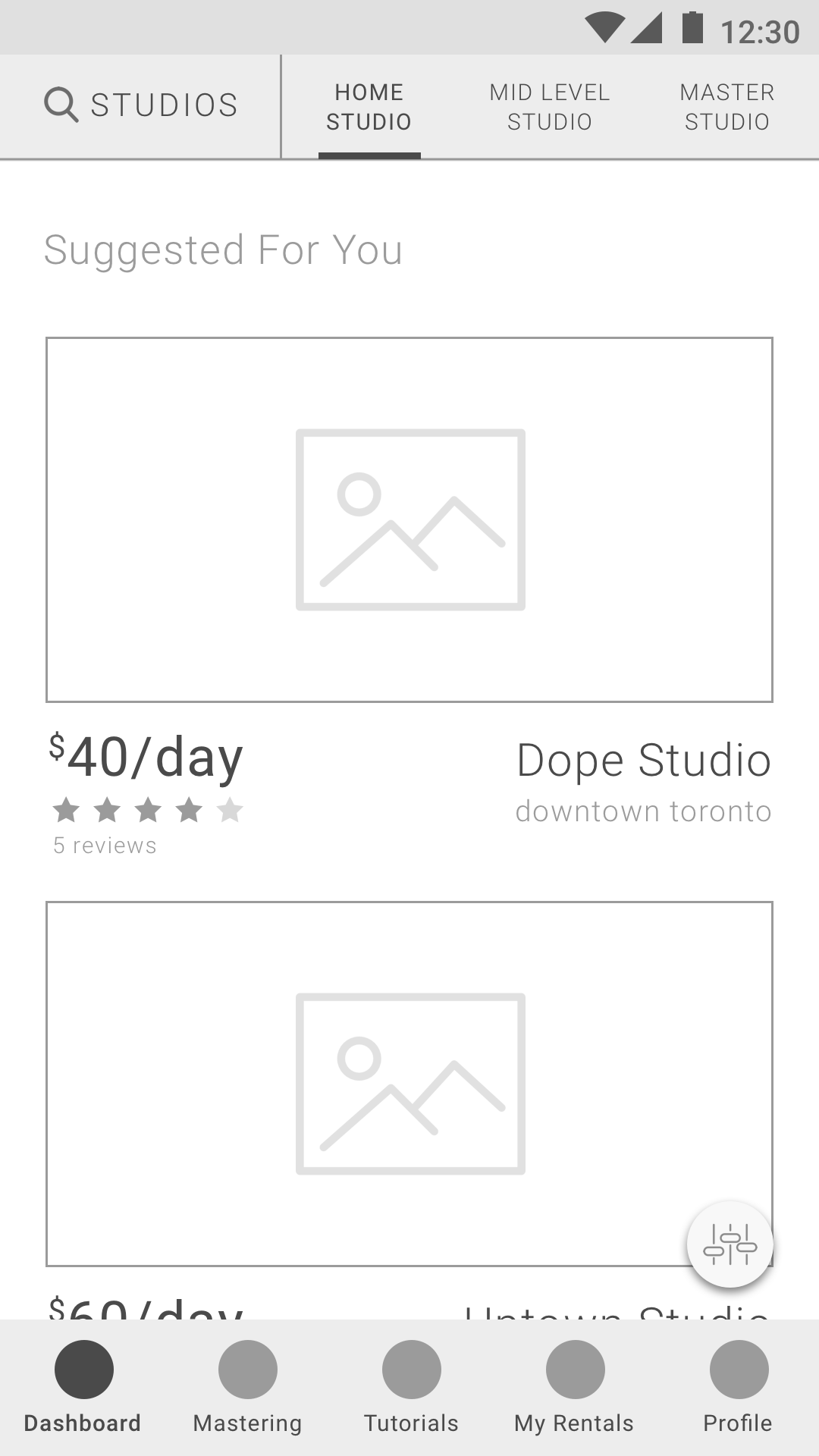
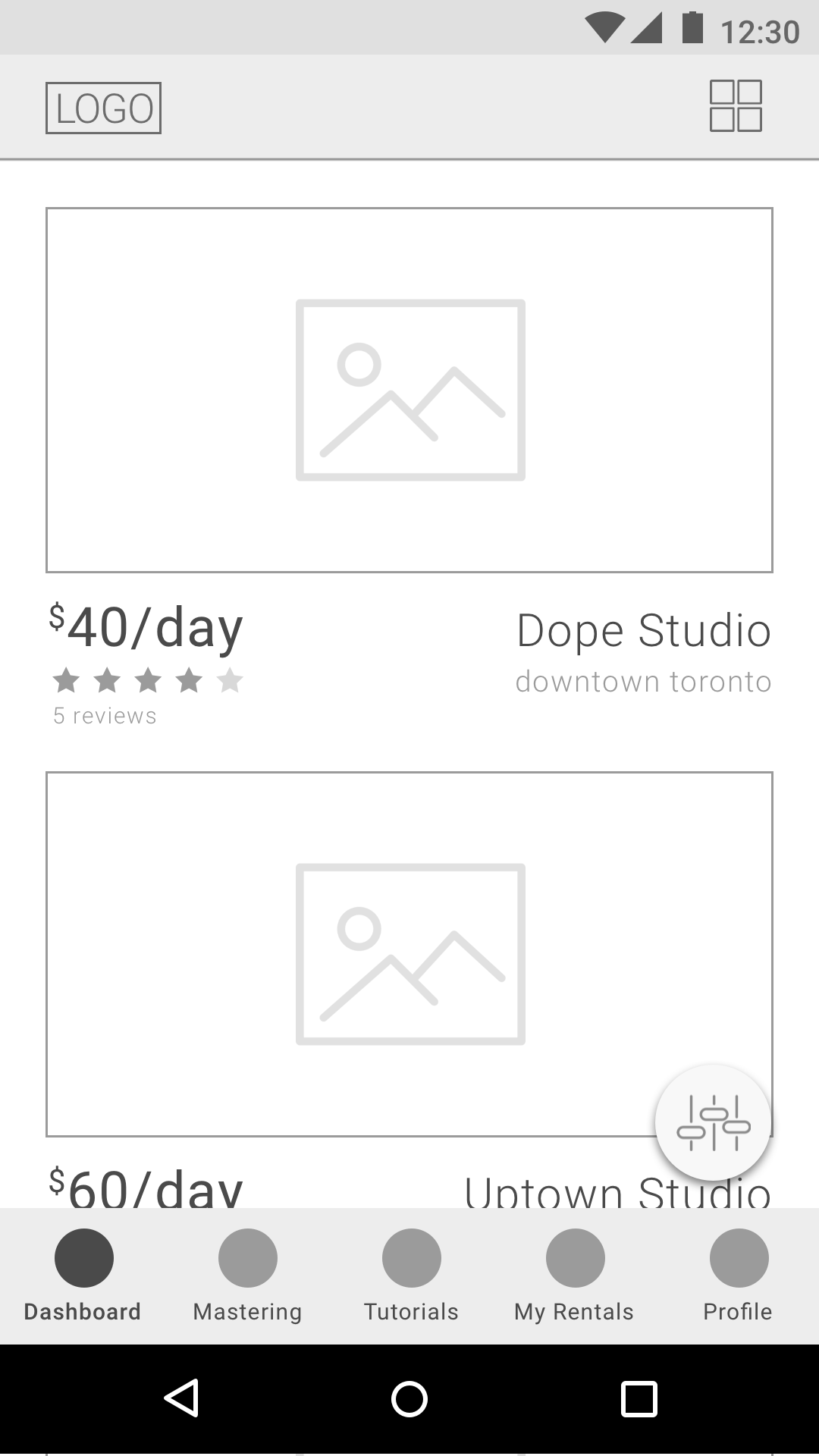
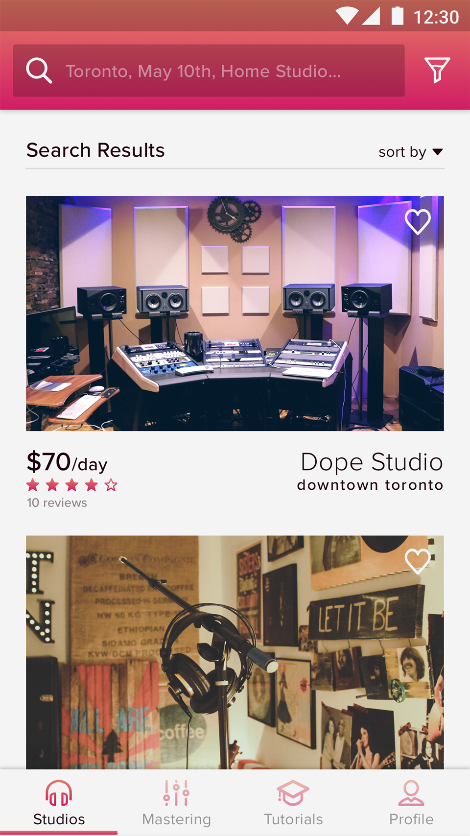
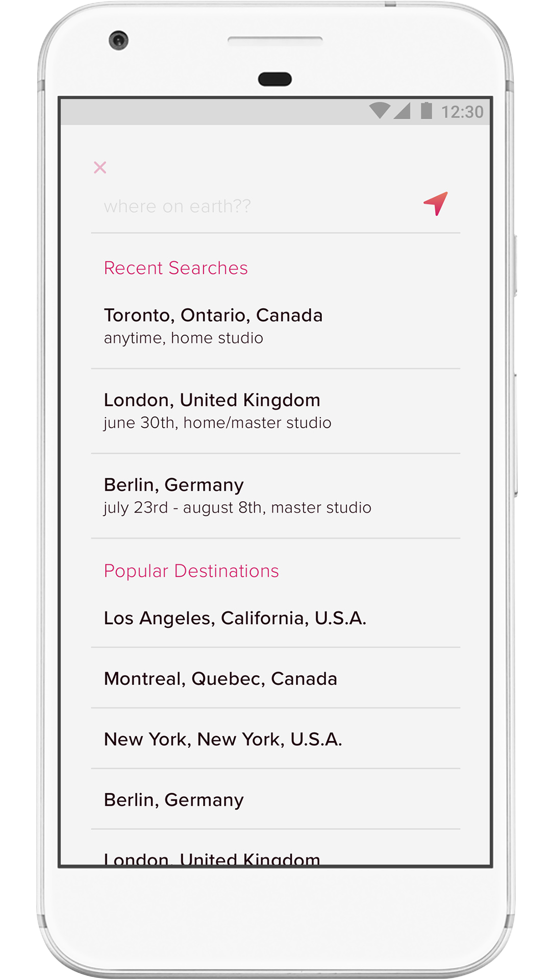
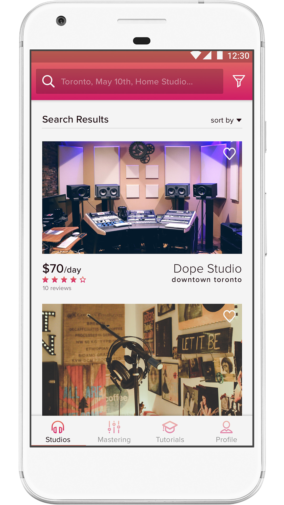
Results Screen - Left to right: 1st, 2nd, 3rd iteration
For this screen not many changes happened through my iterations. With the first iteration, the main issues were within the two nav bars. The top nav had the three studio options that users felt you could only select one at a time, but would like the option to look at multiple styles of studios at one time. The floating filter button was clear to users, but it felt unnecessary as a floating option. The majority of users thought it would do better in one of the nav bars. In the second iteration I added the option to change the view from landscape to grid. Users felt this option shouldn't be there or wouldn't get used because you want to see the space you are renting.
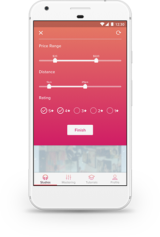
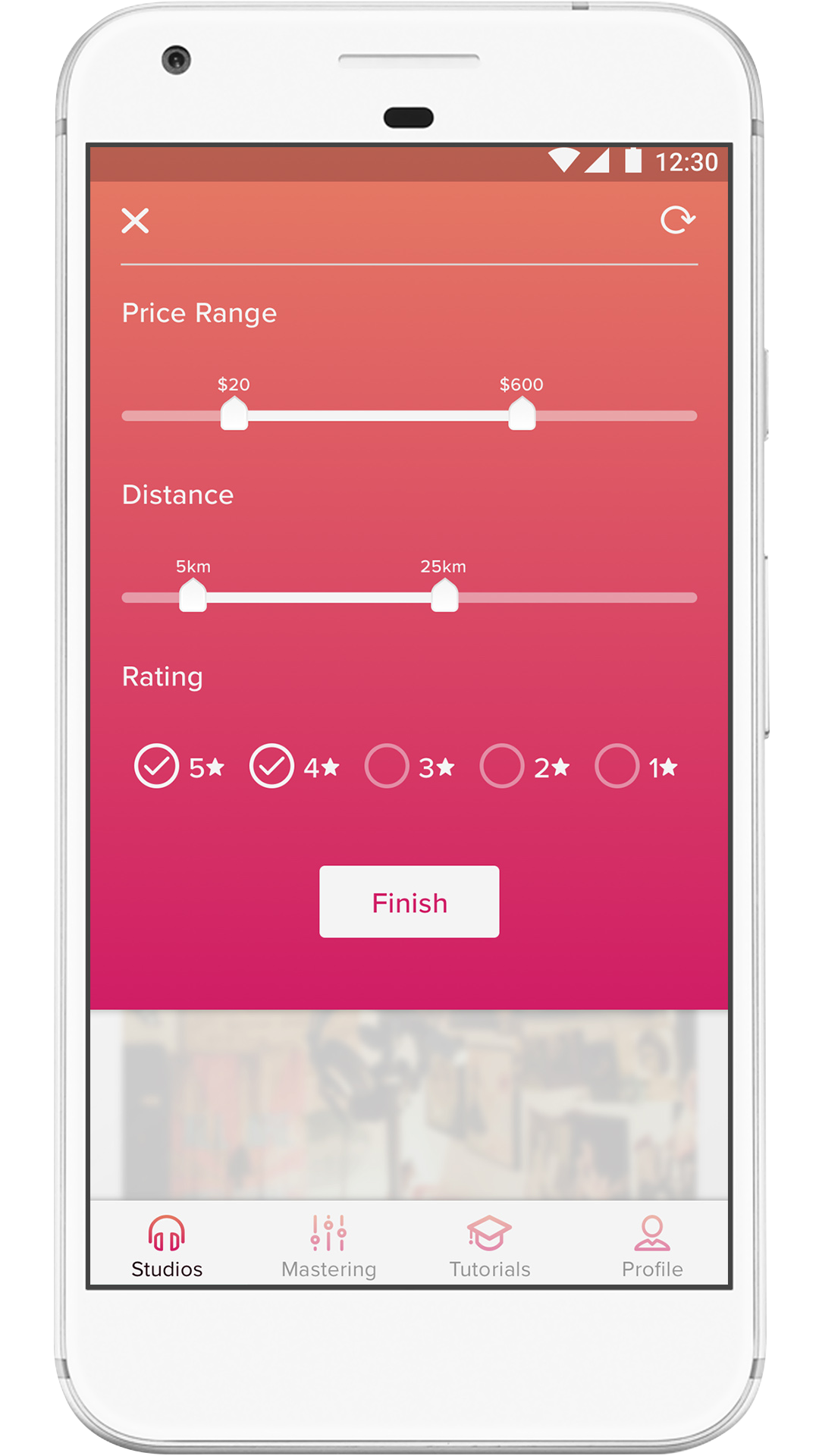
Filter - Left to right: 1st, 2nd iteration
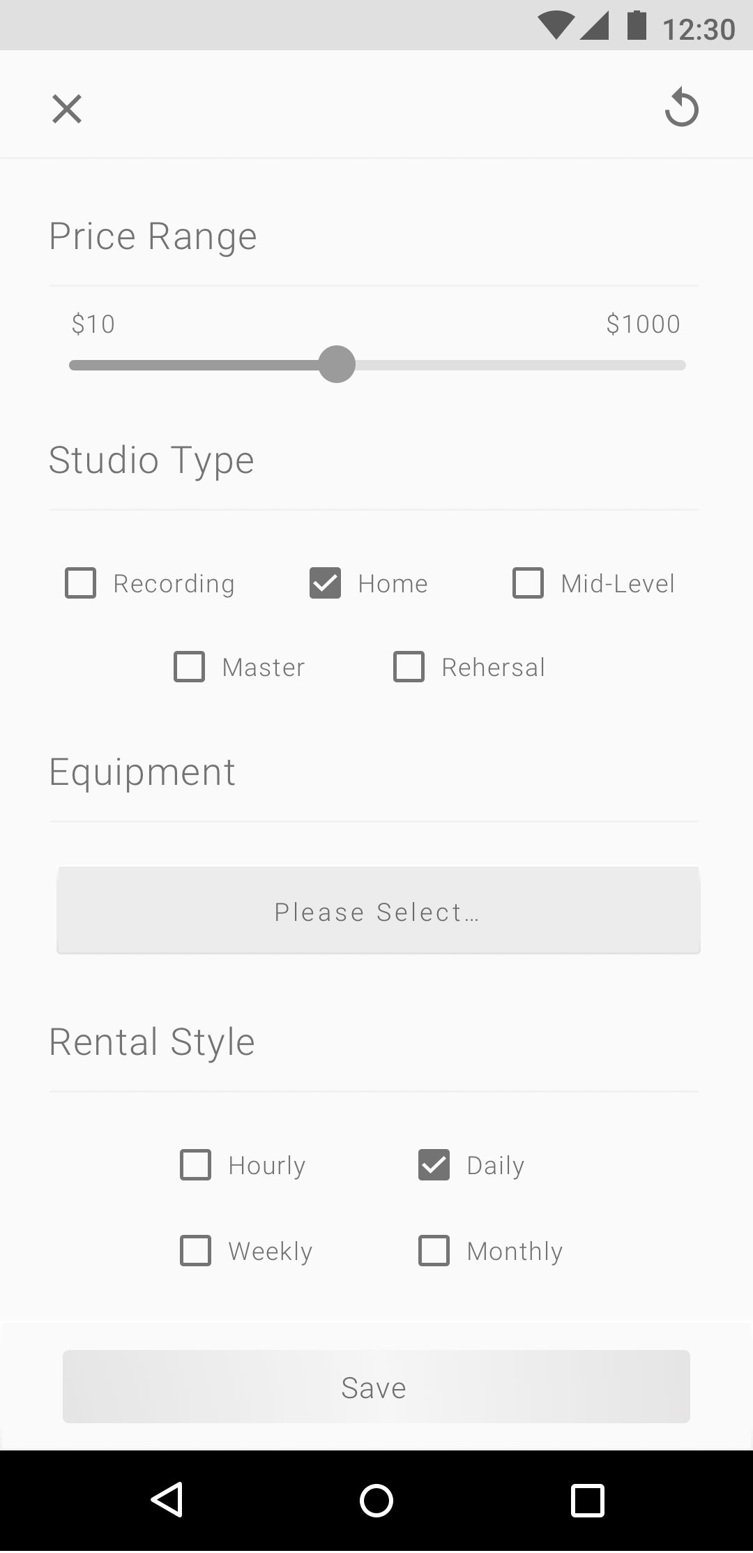
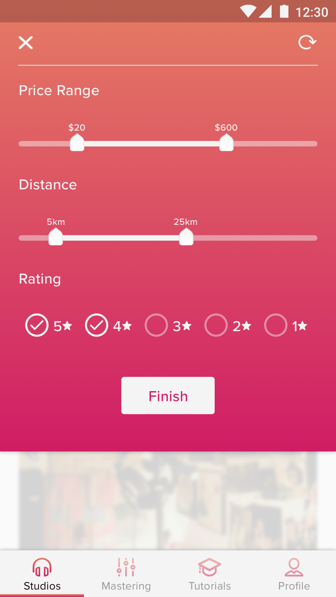
The filter was actually not developed in the first iteration. It left users at a dead end, so I decided to build one out for the 2nd iteration. There were lots of issues with this one that I didn't think about when originally designing it. The price range slider didn't let you select a range. Users felt the 'Studio Type' section should belong in the search not in the filter. 'Rental Style' and 'Equipment' were not clear in this location so I removed them.
High Fidelity Screens
Branding
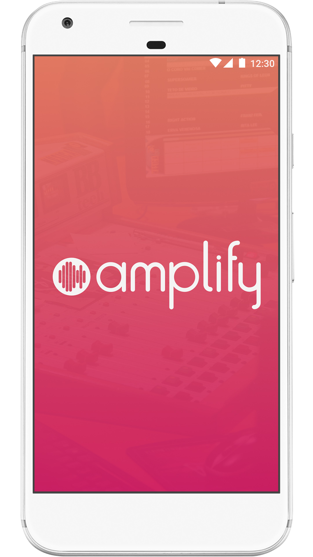
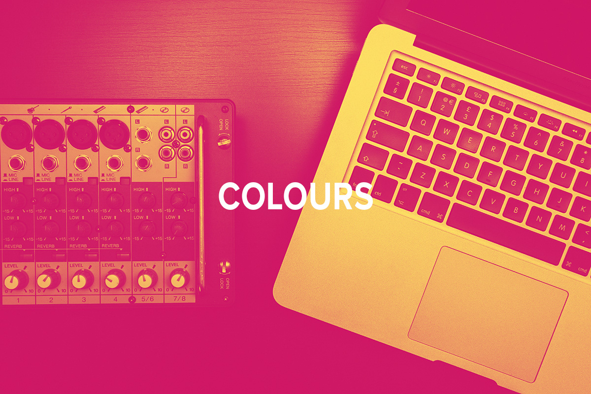
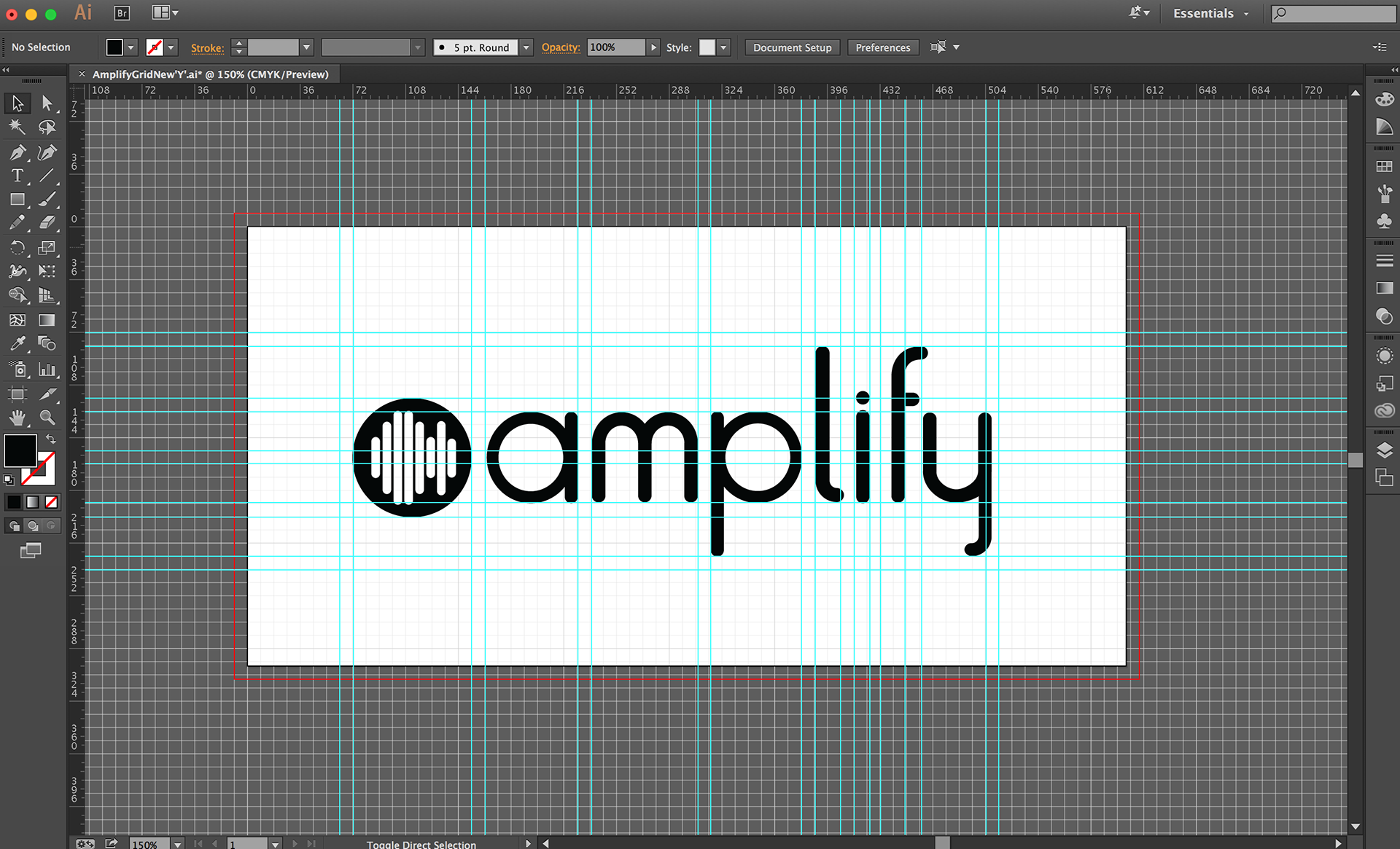
I took colours from a photoshop action effect that turned pictures duotone. I cycled through the different filters and decided on the one below. The font I used for the logo name was a custom font I created in illustrator.
Prototype